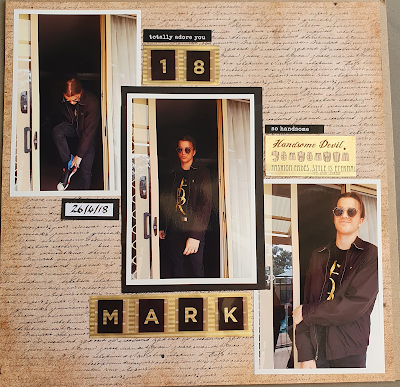
Hey, check out this layout I did of my son on his 18th birthday. Isn't he a cool dude?
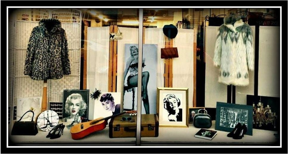
This page is my design inspiration for June's challenge at ARTastic this month.
Below is the window display we are taking inspiration from.
The photos of my son reminded me of the screen in the middle of the window display. I've used black, cream and gold and a nod to dressing up/fashion. I've also added a frame to one pic.
I've followed the design principle of the three, using 3 photos and allowing the eye to move along the page diagonally.
Hope you can join us. You could do something really cool with this inspirational scene I'm sure.
Dale x


No comments:
Post a Comment