Sunday, July 31, 2011

Get Picky Ch#10


For the current Get Picky challenge we had to take inspiration from the butterflies below and be sure to use multiple photos. I've picked three of the colours and used 3 different coloured butterflies in my layout.


Products used are:

My Mind's Eye - Quite Contrary/Mary Mary "Wonderful" Fance Flowers and "Beautiful" Gorgeous papers
Hambly screenprints/wings
Crate Paper restoration border
Girl's Paperie paprk girl die-cuts
Manor House Creations flower/Fantasy Magic
The Scrapcake Spring Awakening Tags
Kaisercraft Chanteuse/Marcato

Wk 9 of RERT - double layout and card


The challenge for this week was the Barossa Valley but the only criteria was it had to be a double for the layout and add strips of paper for the card. Super easy.  Here are the many products I used to create the above double pager:

Studio Calico/Elementary/Atmosphere PP
Sassafras yellow paper
Basic Grey Wander/Gridlock PP
My Mind's Eye Breaking Free/Oh so very hot sun kissed stars PP
Basic Grey/archaic pp
Core-dinations CS Aegean Belle
October Afternoon seaside alphas
white cs
BG Wander eleement stickers and rub-ons
daisy hill vellum - Travel
cherryArte CB Morrocco

I made this card for a male birthday. If you are a male relative of mine and see it hope you like it because it may be in your future.

Thursday, July 28, 2011

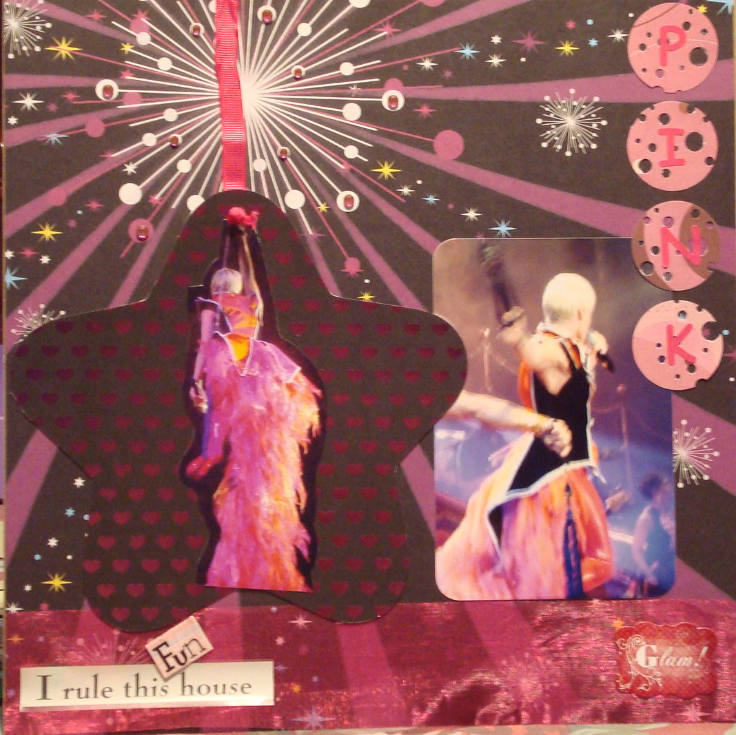
Pink for Scrap The Girls


I rule this Fun House

Here's my layout for Scrap The Girls. It's totally Pink and I have a sub-title inspired by her song Welcome to the Funhouse. She is one energetic lady on stage.

July 2011's challenge is to scrap a Layout using this album cover by ‘Pink’ ‘Greatest Hits….So Far’ as your inspiration.

Choose the colours, design, words whatever grabs you and use them to create your layout, girls only of course.
AND you have to choose any song title or lyrics by Pink and use them anywhere on your layout,
either as a title on your page or in your journaling.

Sunday, July 24, 2011

Punky Scraps Ch# 23


Here is my submission for Punky Scraps challenge #23. Lots of criteria for this:
turquoise, red, 3 circles, stitching and photos not of people. I've got the LOT. They also mentioned staples but I don't use those as those aren't photo safe so I've left that one off.
The photos are of the Props Dept of Warner Bros Studio. Full of amazing stuff it is.

Thursday, July 21, 2011

RERT - Wk 8 Layout and card


Week 8 of the Red Earth Road Trip is Burnie in Tasmania. We've been let loose a little bit as the criteria was to use paper and layer it. Easy peasy Japanesy. I loooooove paper.

For the card I've done a circle shape and followed through with 1" circles punched from scrap paper, layered a vellum title and a CB piece in a similar colourway. Done.

The layout is a lot of My Mind's Eye Quite Contrary line with some crate paper borders and some extras. Another Prima flower. Now that's two layouts in a row. Wow.

Tuesday, July 19, 2011

ARTastic submission

I happen to love the colour maroon and I also love hats. Perfect combination for me to try the July challenge at ARTastic this month. You had to use a photo of yourself, monochromatic red or maroon and a hat or gloves.  Guess what, I've also managed to use some Prima flowers. These sit happily in their box for me to admire and usually not much else. Patting myself on the back today for actually using 3 different packages of Prima lovelies in this layout.

Monday, July 18, 2011

What's Up Doc?


Sketch-July-2011.jpg

Here is my layout for Anna's Craft Cupboard's July sketch challenge. I've included 3 photos as the two little ones in the sketch just weren't enough for me. I think it works just as well. The background paper is Studio Calico State Fair. I just love that range.